
THE FLYWHEEL EFFECT
We did a deep-dive review of the Looppanel marketing site to see if its UX matched its promise: helping research teams turn hours of analysis into actionable insights, all in one place.

Looppanel makes a big promise: to cut through the grind of research analysis and turn scattered conversations into a single source of truth. That means its own site should quickly show how it saves time, builds confidence, and helps teams share insights without the usual friction.
We ran the experience through the Flywheel UX Agent to see if the story came through as clearly as the design.
Here’s what we uncovered.
Snap Judgement
Test Objective
To understand how effectively Looppanel’s marketing site communicates its value proposition, builds trust, and enables UX Research Managers to evaluate whether the product addresses their core pain points.
Product Tested
www.looppanel.com
This teardown will evaluate Looppanel's marketing website through the lens of usability, clarity, and design consistency. We focused on a high volume marketing use case:
Homepage → Customers → Raylo Case Study → Pricing
Scenario
As a UX Research Manager exploring Looppanel for your team, you want to quickly grasp what the platform does, understand how it can make your work easier, see credible proof from customer success stories, and get a clear picture of pricing.
User Task List
Navigation start:
Open your browser and go to www.looppanel.com.
First impressions:
Without clicking, describe your first impression of the site. What stands out to you?
Customers Page:
Navigate to the Customers page - describe your throught process.
Ease-of-use rating:
On a scale from 1 (very difficult) to 5 (very easy), how would you rate the ease of finding information so far?
Case Study:
Explore the Raylo Case Study - which parts explain the value of Looppanel the best?
Value Proposition:
Is it clear what value Looppanel can bring to your team/process. Does it align with your expectations?
Pricing clarity:
Is the pricing page clear? What would be your next step?
Conversion intent:
Based on what you’ve seen so far, would you consider trying Looppanel? Why or why not?
Improvement suggestions:
If you could change one thing about the site, what would it be and why?
Final thoughts:
Do you have any other feedback you haven’t shared yet?
Synthetic Patcipitants
Goals: Share insights seamlessly
Pain Points: Research buried in docs and tools
Behaviors: Advocates for workflows, prioritizes discoverability
Goals: Influence product decisions with evidence
Pain Points: Research undervalued, manual work is slow
Behaviors: Presents to execs, seeks automation
Goals: Ensure research quality, avoid wasted effort
Pain Points: Error-prone manual synthesis
Behaviors: Oversees team, looks for process optimization
Goals: Enable cross-team collaboration
Pain Points: Insights siloed across teams
Behaviors: Champions tools that simplify sharing
First Impressions
Before diving into detailed fixes, here’s how Looppanel’s homepage lands with new eyes:
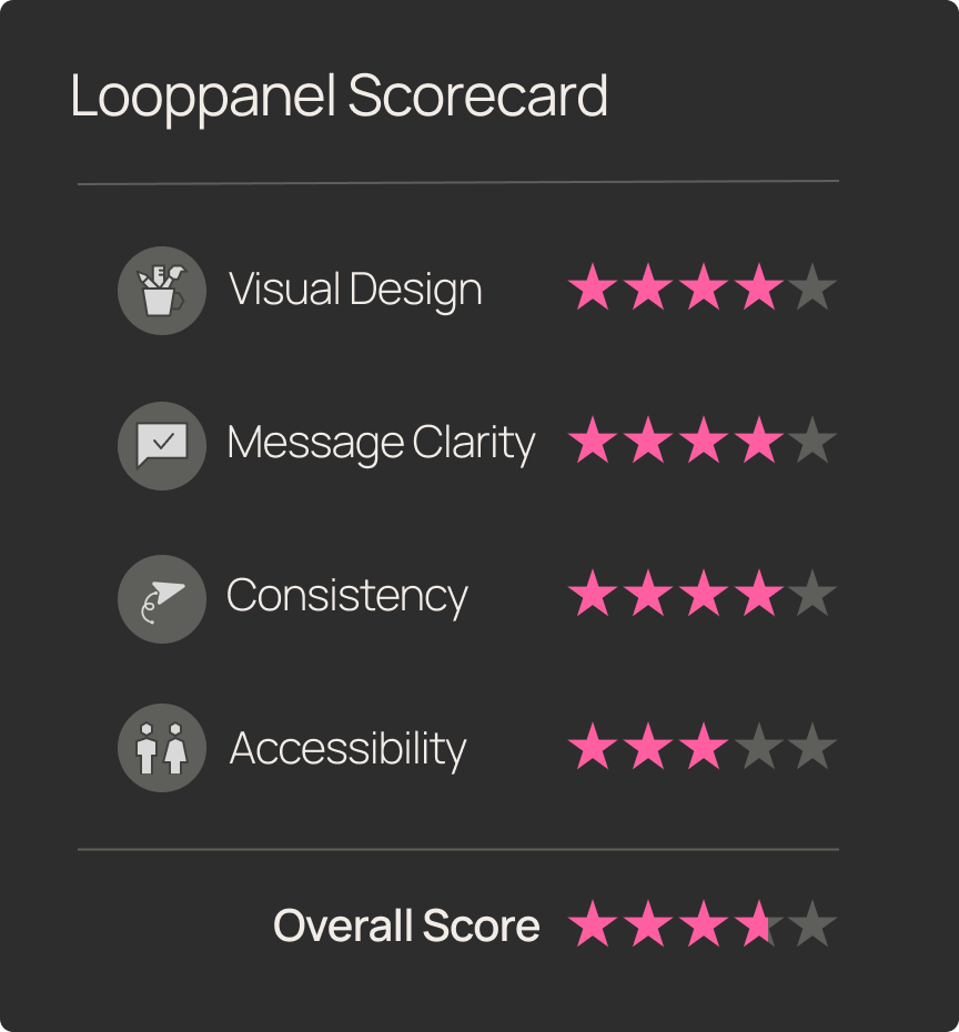
- Usability? Clean and approachable.
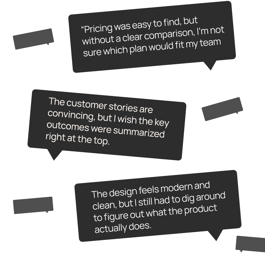
- Visual clarity? Strong design, but key features hide in the fine print.
- Messaging? Aspirational, yet light on specifics.
TL;DR: Looppanel looks trustworthy at first glance, but it takes extra effort to understand exactly what it offers.

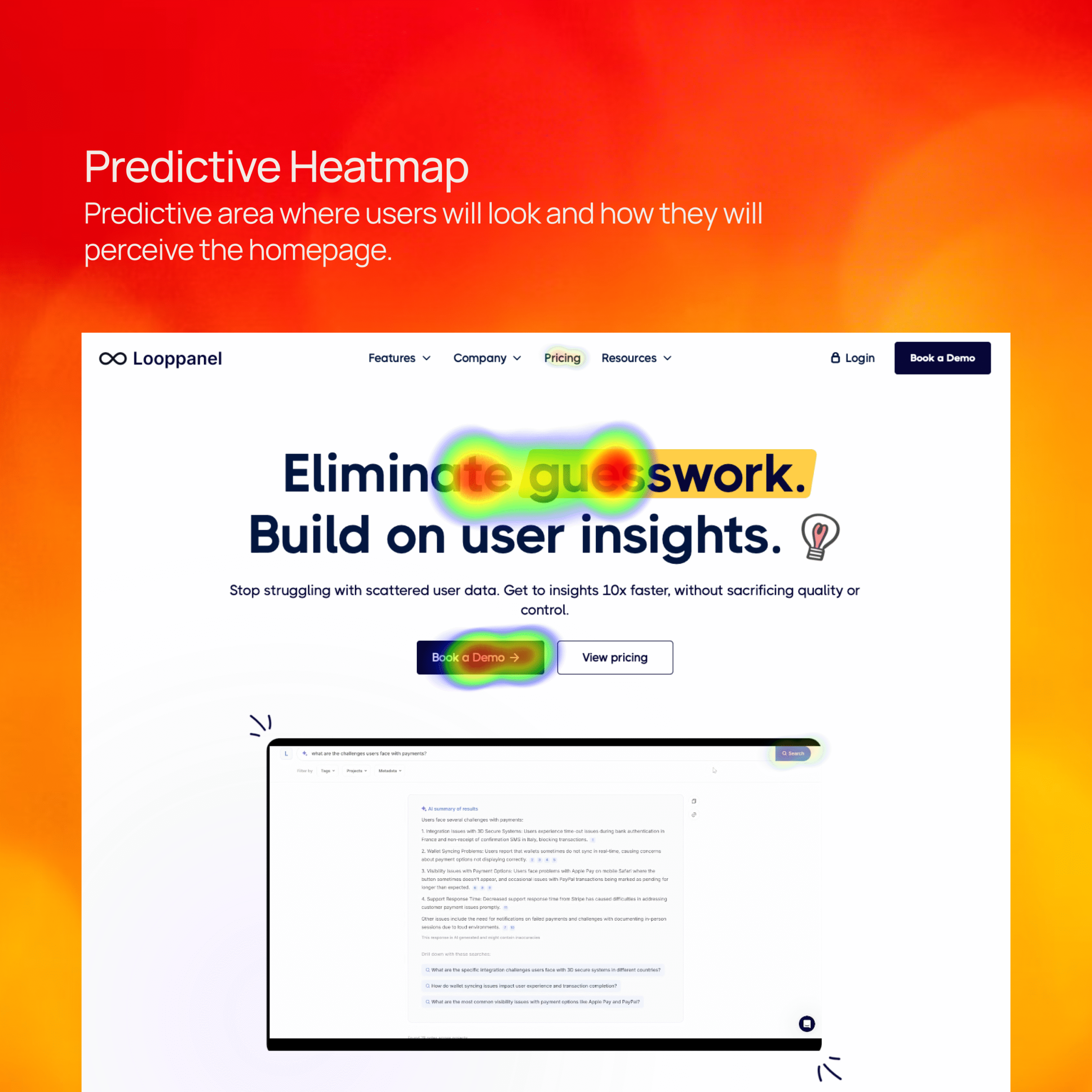

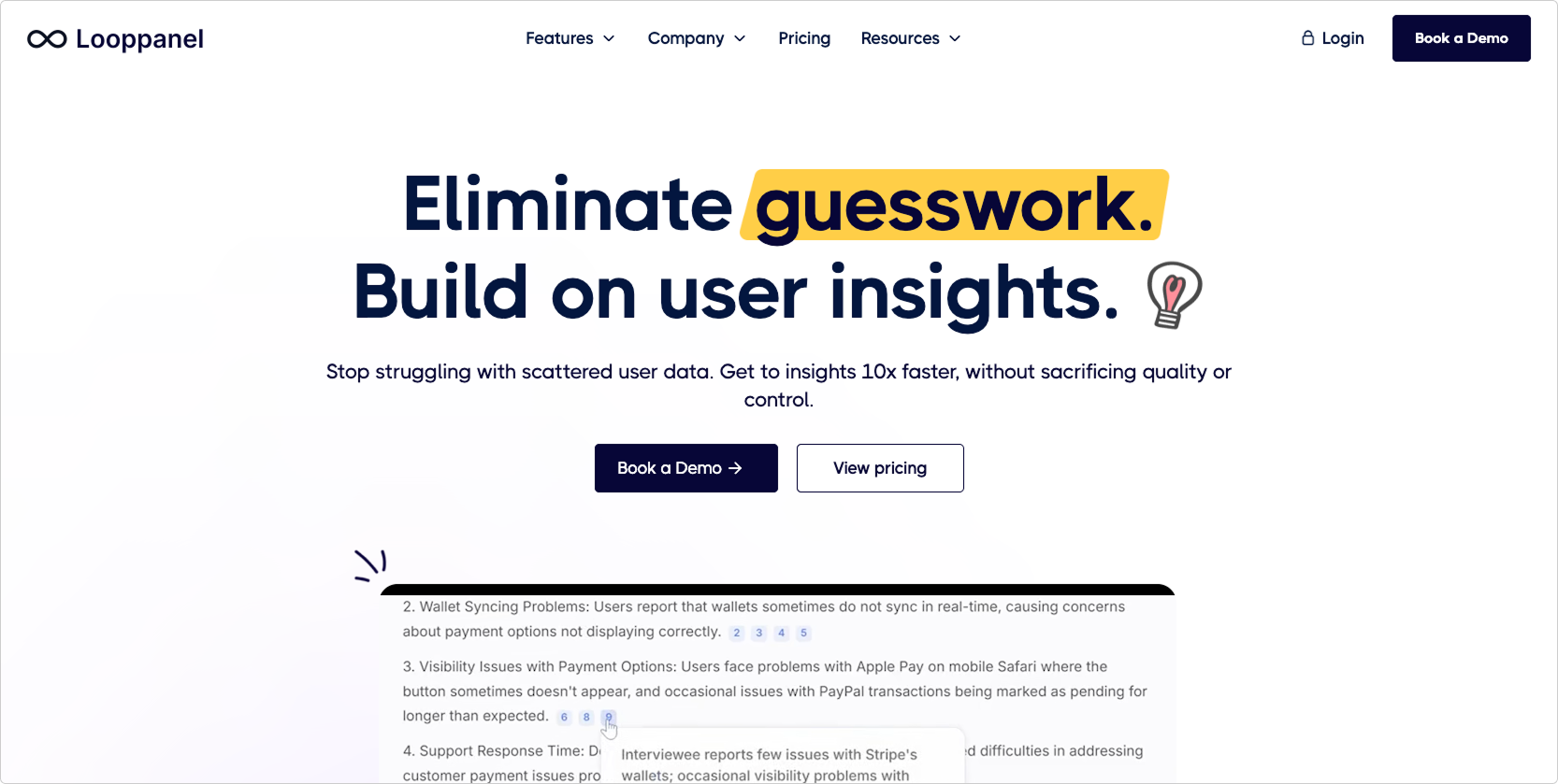
The homepage headline establishes credibility, but the product’s core features (repository, AI tagging, search, cross-team sharing) aren’t immediately visible. Users had to dig into secondary pages to piece together what Looppanel actually does.
Improvement Recommendation: Add a feature strip under the hero section with 3–4 icons and short labels (e.g., “AI Transcriptions,” “Insight Repository,” “Tagging & Search,” “Cross-team Sharing”). Support the headline with visuals that communicate value at a glance.
Value of the Change: The faster users understand what Looppanel does, the more likely they are to trust it and keep exploring. That means stronger comprehension in the first 5 seconds — and more conversions down the line.

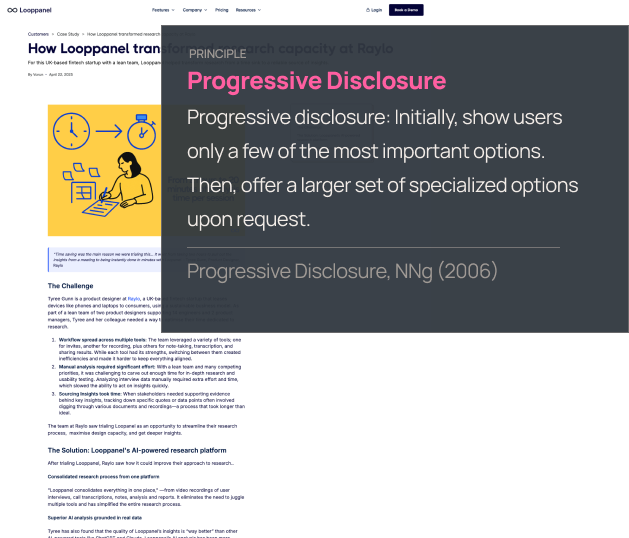
The Raylo case study resonated with participants, but the long-form text and weak visual hierarchy made it difficult to scan. Key impact metrics (like faster insights) were easy to miss in a wall of copy.
Improvement Recommendation: Restructure case studies with an executive summary at the top, bold impact metrics, section headers, and visual callouts for key results or quotes. Highlight outcomes upfront, then let the details follow.
Value of the Change: Users will grasp Looppanel’s credibility and ROI faster. That makes it easier for busy research managers to advocate for adoption — without losing patience while scrolling.
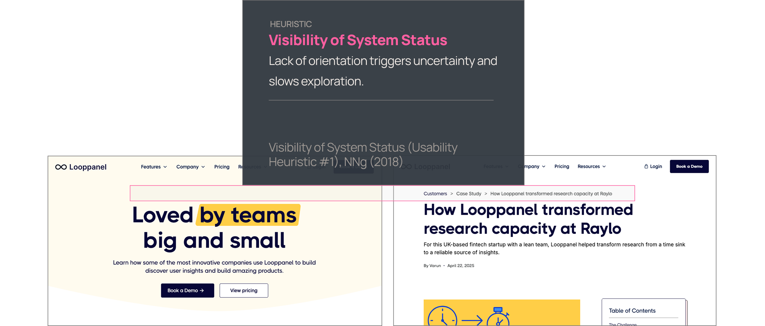
The global navigation surfaced the right content, but users weren’t always sure where they were on the site. No breadcrumbs or active-state cues reinforced their location, which created low-level uncertainty.
Improvement Recommendation: Add active navigation highlights, clear hover states, and breadcrumbs on deeper pages (like case studies). Reinforce orientation through consistent visual cues.
Value of the Change: When users feel grounded in a site, they spend less cognitive effort on wayfinding and more on evaluating the product. That increases trust and reduces bounce risk.
Final Thoughts
Looppanel’s site is clean, credible, and makes a strong first impression — but it often makes users work too hard to see the product’s value. With sharper messaging and a few key design adjustments, it could move from “trustworthy” to truly compelling.
What’s working:
- Modern, professional design that inspires confidence
- Clear pricing visibility without paywall friction
- Customer stories that resonate with research managers
What's holding it back:
- Homepage that hints at features but doesn’t show them upfront
- Case studies that bury the impact in walls of text
- Navigation and consistency gaps that decrease trust and increase bounce risk
With the right fixes, Looppanel can highlight its strongest assets — speed, clarity, and collaboration — and create a marketing site that mirrors the product’s promise: making research faster, easier, and more impactful.
Meet Flywheel
Your Always-On AI Research Assistant
The Flywheel Growth UX Agent doesn’t just test your product — it uses it. It builds synthetic participants, runs full-scale usability tests, and then thinks like a senior UX researcher — spotting hidden issues, prioritizing what matters most, and recommending fixes that actually drive growth.
This is The Flywheel Effect — continuous, high-quality research without the recruiting, delays, or guesswork.
- Better UX fuels more engagement.
- More engagement generates richer customer data.
- Richer data sharpens the Flywheel’s next round of insights.
It’s a loop that only gets smarter with every spin.
See what it can do for you→ Learn more at Flywheel Growth
The Upside
Sign up to receive The Upside - the Flywheel monthy newsletter highlighting growth stories and new tools and added to the platform.

Stop thinking small - let it fly
Privacy Policy
Flywhweel 2025
RESOURCES
Insights
Who We Are
Icons & Illustrations by Streamline
Animation by Weldi 33 Studio Design