
THE FLYWHEEL EFFECT
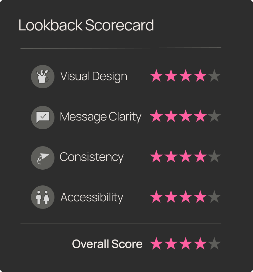
We did a deep-dive review of Lookback’s homepage-to-pricing journey to see if its UX matched the bold promise: one powerful platform for all your qualitative research—from moderated interviews to unmoderated tasks.
From the first screen, Lookback reads as a purpose-built research platform; the Product page then makes the “how” explicit—Moderated Usability (LiveShare) plus unmoderated testing.
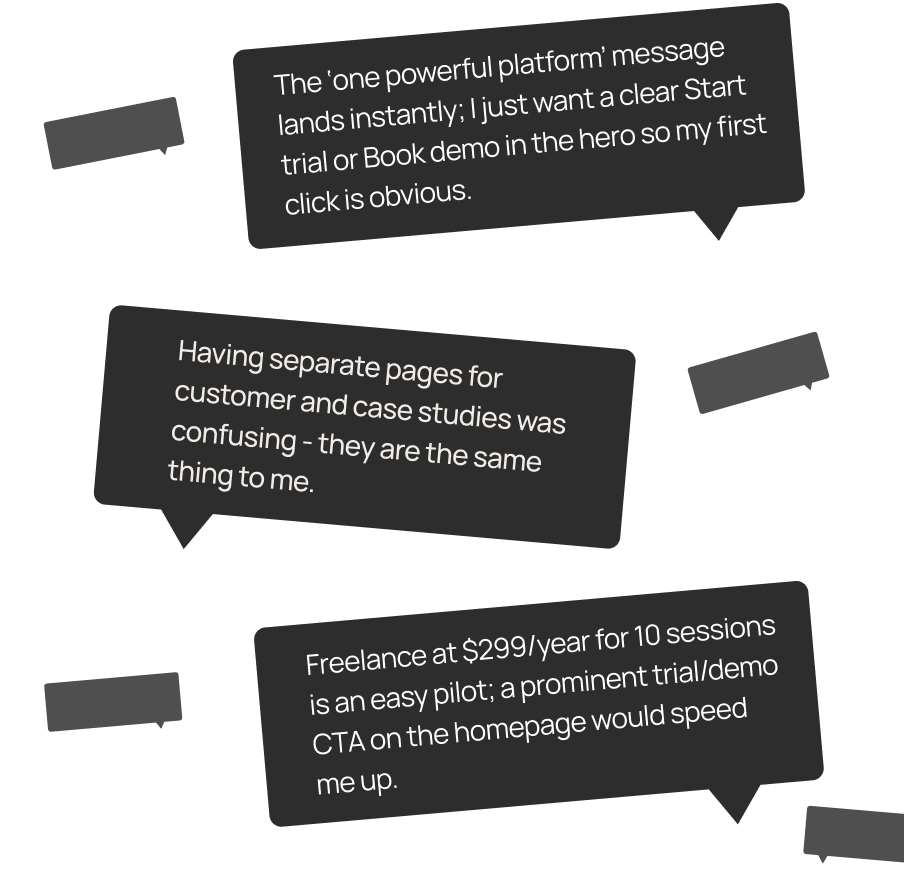
Pricing is easy to find and scan. The Freelance plan shows $299/year for 10 sessions with clear add-on pricing and transparent panel/BYO details. Participants, however, paused to translate “sessions” into per-study cost and sought a calculator.
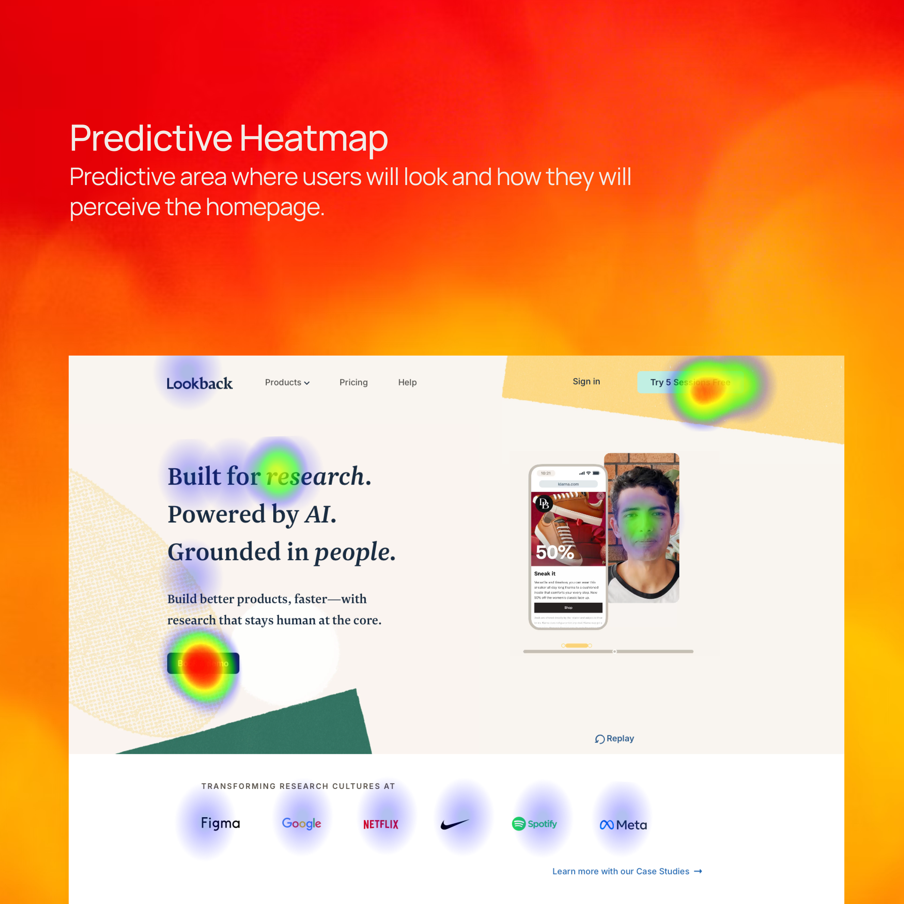
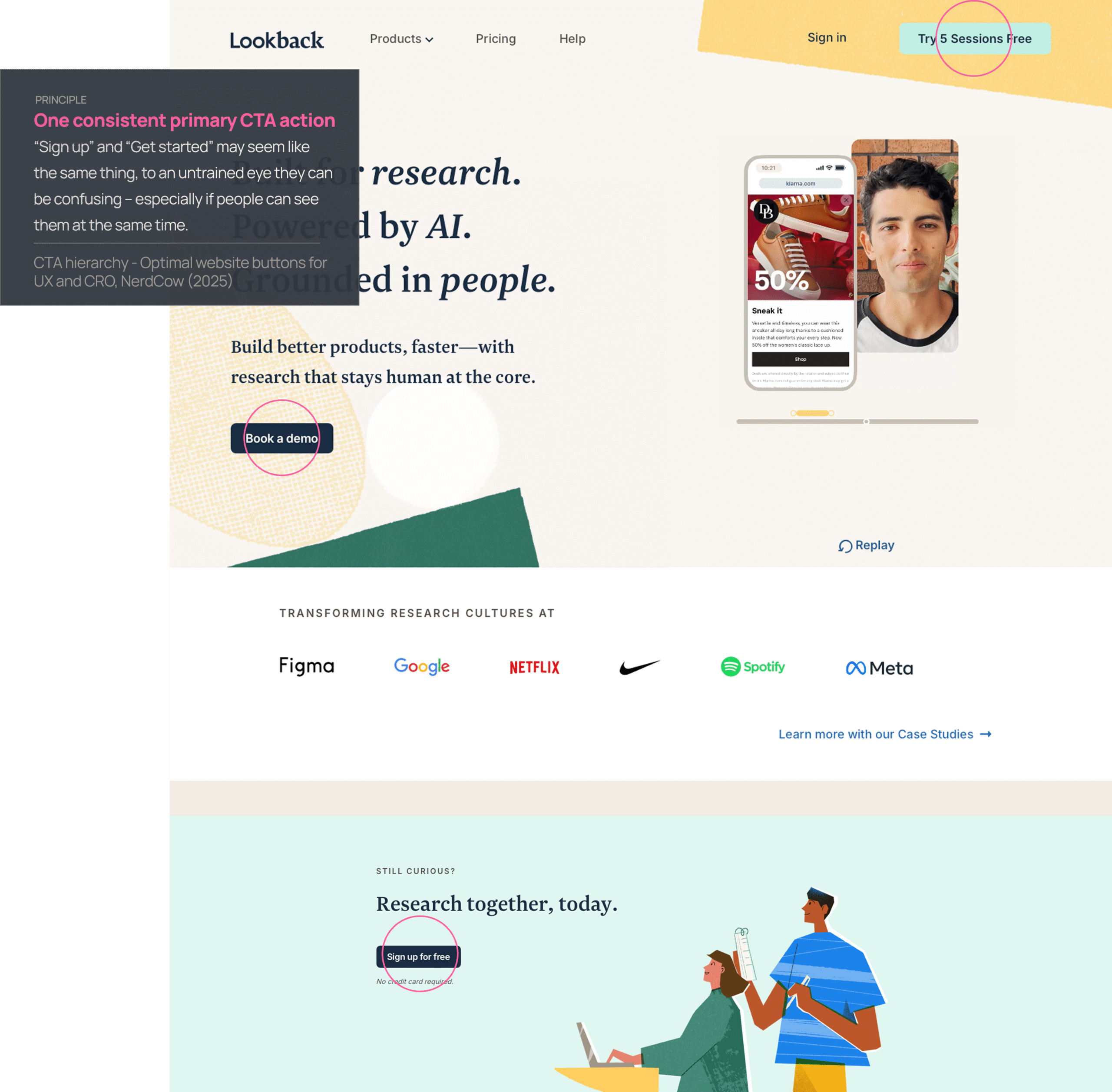
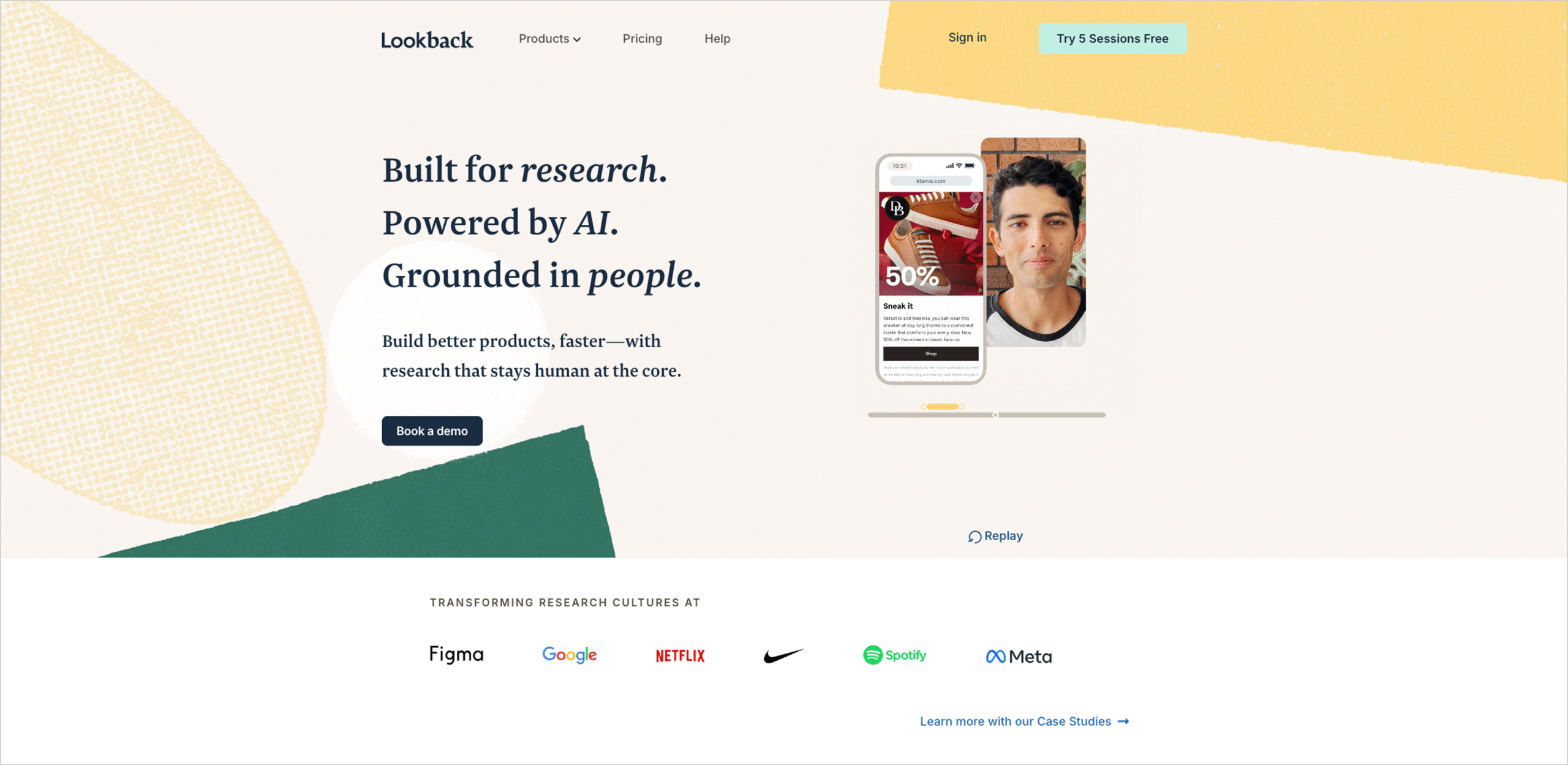
Three of five PMs hesitated at the hero, split between “Book a demo” and “Try 5 Sessions Free”—a sign the CTA hierarchy needs sharpening.
Snap Judgement
Test Objective
Evaluate whether growth-stage SaaS PMs can (1) quickly understand Lookback’s value, (2) validate with proof, and (3) confidently choose a plan.
Product Tested
www.lookback.com
This teardown will evaluate Lookback's marketing website through the lens of usability, clarity, and design consistency. We focused on a high volume marketing use case:
Homepage → Usability Testing (Product) → Customers → Intuit case study → Pricing
Scenario
As a Product Manager at a grwoth SAAS company, imagine that you are in the process of picking a usability-testing tool for your product team. Confirm capabilities (moderated + unmoderated), see social proof, and understand pricing to decide whether to start, talk to sales, or move along.
User Task List
Navigation start:
Open your browser and go to www.lookback.com.
First impressions:
Without clicking, describe your first impression of the site. What stands out to you?
Customers Page:
Navigate to the Customers page - describe your throught process.
Ease-of-use rating:
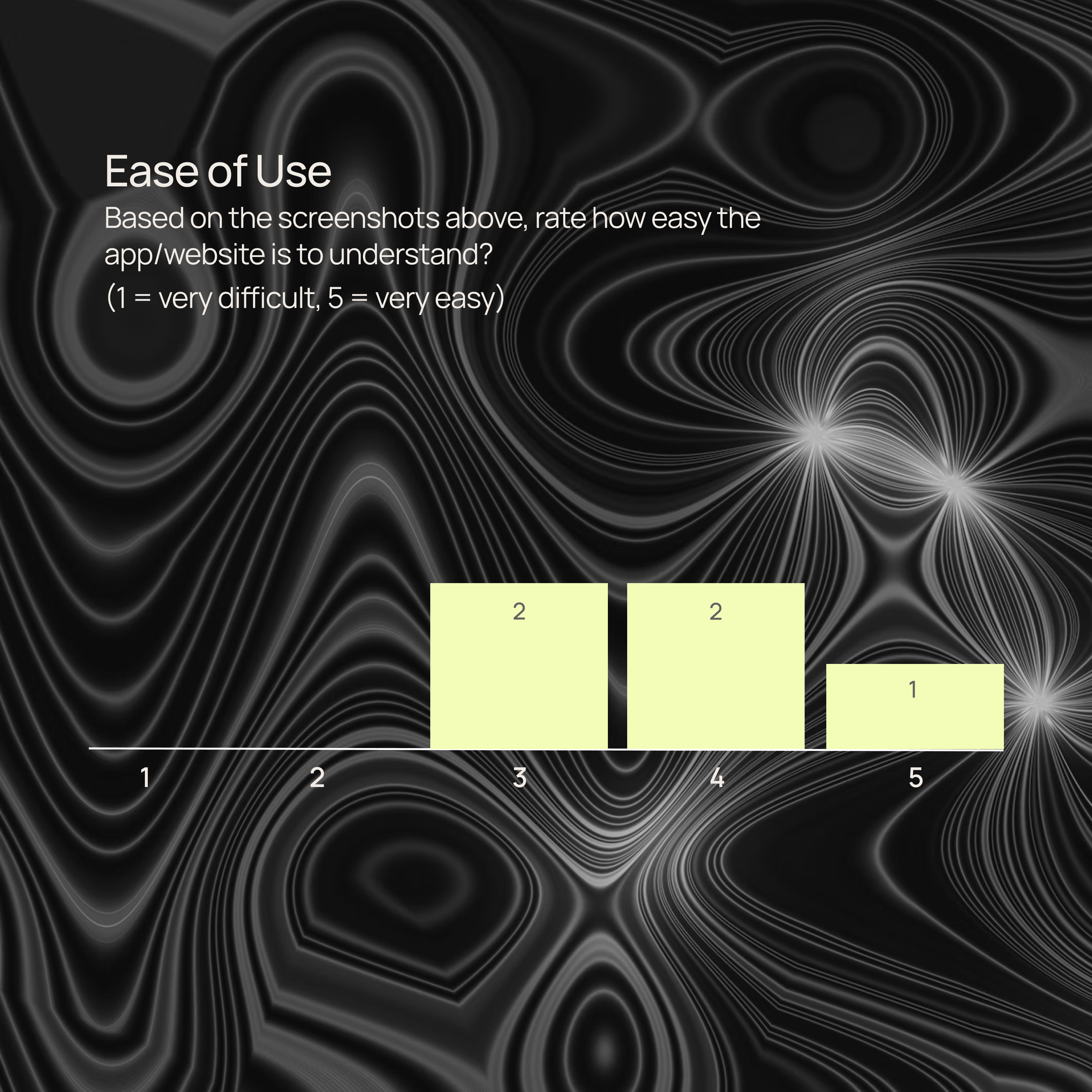
On a scale from 1 (very difficult) to 5 (very easy), how would you rate the ease of finding information so far?
Case Study:
Explore the Intuit Case Study - which parts explain the value of Lookback the best?
Value Proposition:
Is it clear what value Lookback can bring to your team/process. Does it align with your expectations?
Pricing clarity:
Is the pricing page clear? What would be your next step?
Conversion intent:
Based on what you’ve seen so far, would you consider trying Lookback? Why or why not?
Improvement suggestions:
If you could change one thing about the site, what would it be and why?
Final thoughts:
Do you have any other feedback you haven’t shared yet?
Synthetic Patcipitants
Goals: low-friction self-serve start; quick experiments
Pain points: unclear pricing math; tool sprawl
Behaviors: looks for “try/demo” CTA; compares plans
Goals: reliable mobile capture; remote observation
Pain points: device logistics; cross-team alignment
Behaviors: hunts for unmoderated “Tasks” and mobile details
Goals: bring observers; share insights quickly
Pain points: competing team demands; governance
Behaviors: scans Customers → case study → Pricing
Goals: keep spend tight; ad-hoc studies
Pain points: budget; limited researcher time
Behaviors: Pricing first; checks BYO participants
First Impressions
Before we get tactical, here’s the first 5 seconds on Lookback:
- Clarity? High—the “what” and “why” land fast.
- Momentum? Light—the hero nudges education over action.
- Polish? Solid.
TL;DR: Tell me what it is—nailed. Tell me what to do—almost there.

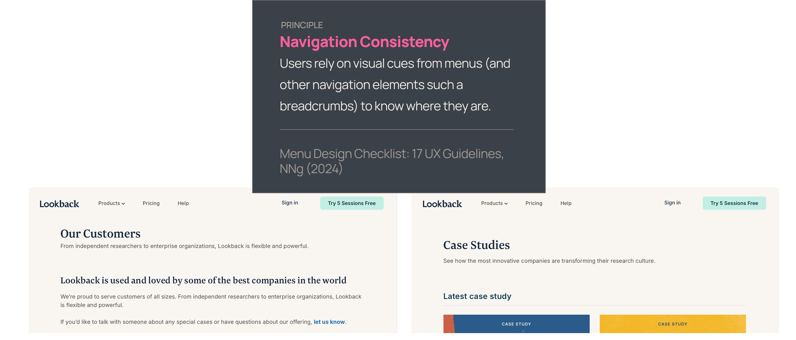
Problem: Customers and Case Studies are on separate pages. Customers sits on the main domain, while Case Studies open on the blog subdomain; some participants noted the subtle scent break.
Improvement: Keep case studies in a consistent shell (shared header/nav) and/or add breadcrumbs for orientation.
Value of change: Faster trust building → more users progressing to Pricing/demo.
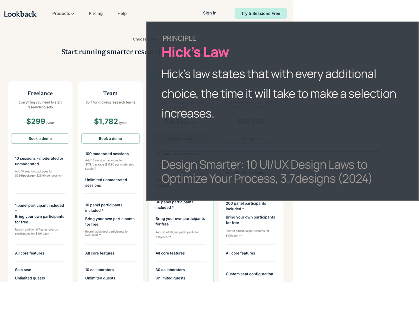
Problem: Overwhelming pricing that makes you calculate. Even with $299/year, 10 sessions, add-ons, BYO free, and $49 panel spelled out, PMs had to convert “sessions” into a per-study number to cut through the noise.
The pricing page is overwhelmingly complicated—pursue a major simplification that removes bundle math and competing concepts (e.g., shift to per-study pricing).
Value of change: Reduced cognitive load → quicker self-serve start, fewer sales questions and less bounce.
Problem: The homepage presents multiple, differently worded primary actions at once—e.g., “Book a demo” in the hero, “Try 5 Sessions Free” in the top nav, “Sign up for free” near the footer, plus a mid-page “Learn about Usability Testing” button. This splits attention and forces visitors to choose between education and two flavors of signup before they’ve anchored on a single next step.
Improvement: Standardize on one primary CTA sitewide (e.g., “Try 5 sessions free”) and make the alternate action (e.g., “Book a demo”) a consistent secondary. Keep education CTAs (“Learn about Usability Testing”) visually subordinate and away from the hero. Align the wording (“Try 5 sessions free” vs. “Sign up for free”) so the offer reads identically wherever it appears.
Value: Clearer first click → less cognitive friction and higher conversion to the key action (trial or demo).
Final Thoughts
Lookback’s site is focused, credible, and makes a strong first impression — but it sometimes asks busy PMs to do more work than necessary to take the first step. With a crisper primary action and a simpler pricing story, it could move from “reassuring” to truly effortless.
What’s working:
- Research-first messaging that quickly communicates moderated and unmoderated capabilities
- Clear navigation with visible pricing and transparent BYO vs. panel details
- Recognizable customer logos and case studies that build confidence
What's holding it back:
- A hero with competing CTAs that dilutes the first click
- Pricing that layers sessions, bundles, and panel options into a heavy mental load
- Case studies that shift context and make the proof path feel less seamless
With the right fixes, Lookback can spotlight its strongest assets—clarity, credibility, and speed from insight to action—and deliver a site that mirrors the product’s promise: making qualitative research faster, simpler, and more impactful.
Meet Flywheel
Your Always-On AI Research Assistant
The Flywheel Growth UX Agent doesn’t just test your product — it uses it. It builds synthetic participants, runs full-scale usability tests, and then thinks like a senior UX researcher — spotting hidden issues, prioritizing what matters most, and recommending fixes that actually drive growth.
This is The Flywheel Effect — continuous, high-quality research without the recruiting, delays, or guesswork.
- Better UX fuels more engagement.
- More engagement generates richer customer data.
- Richer data sharpens the Flywheel’s next round of insights.
It’s a loop that only gets smarter with every spin.
See what it can do for you→ Learn more at Flywheel Growth
The Upside
Sign up to receive The Upside - the Flywheel monthy newsletter highlighting growth stories and new tools and added to the platform.

Stop thinking small - let it fly
Privacy Policy
Flywhweel 2025
RESOURCES
Insights
Who We Are
Icons & Illustrations by Streamline
Animation by Weldi 33 Studio Design