
THE FLYWHEEL EFFECT
We did a deep-dive review of the Dovetail marketing site to see if its UX matched its bold promise: helping teams make sense of messy feedback.

We found some standout moves — and a few missteps muddying the message.
Dovetail wants to be the go-to tool for customer intelligence. That means its own site better deliver an experience rooted in clarity, confidence, and insight. We ran it through the Flywheel UX Agent to see if it walks the walk.
Here's what we found.
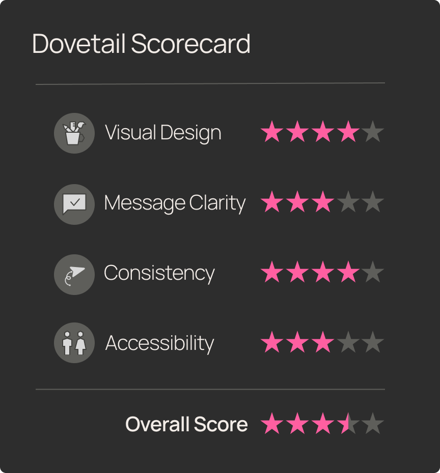
Snap Judgement
Test Objective
Run a full-scale usability test with synthetic participants to identify friction points, uncover opportunities for improvement, and highlight high-performing UX elements — with a focus on clarity, accessibility, and user confidence.
Product Tested
www.dovetailapp.com
This teardown will evaluate Dovetail's marketing website through the lens of usability, clarity, and design consistency. We focus on a high volume marketing use case:
Homepage → Product Overview → Case Studies/Testimonials → Pricing
Scenario
You’re a UX Research Manager looking for a new platform to centralize your team’s insights and share them across the organization. Following a web search, you’ve just landed on Dovetail’s homepage and want to quickly understand what it does, see proof it works for teams like yours, and find out if the pricing fits your budget.
User Task List
Navigation start:
Open your browser and go to www.dovetailapp.com.
First impressions (neutral):
Without clicking, describe your first impression of the site. What stands out to you?
Feature discovery:
Locate the main features of the Dovetail research repository.
Ease-of-use rating:
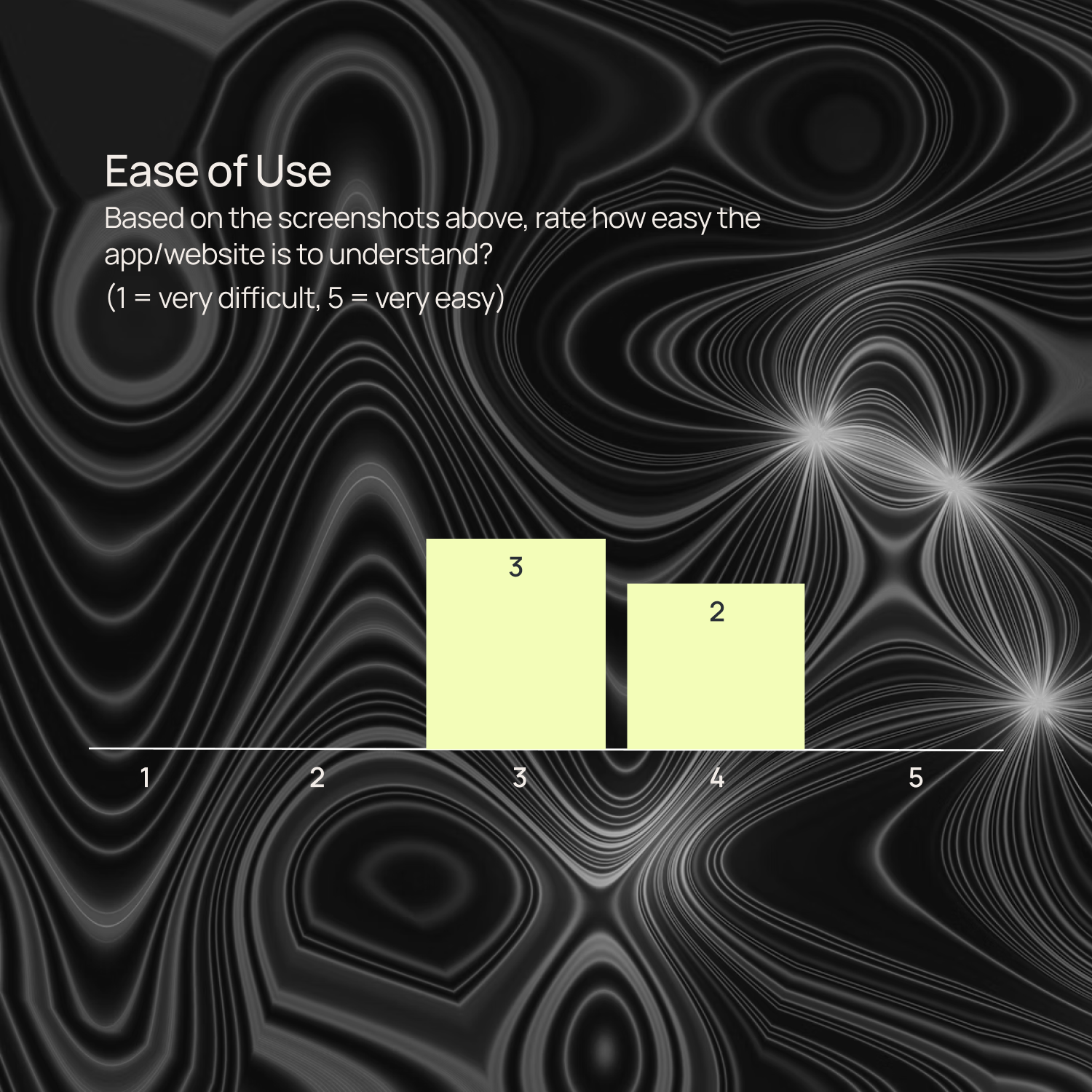
On a scale from 1 (very difficult) to 5 (very easy), how would you rate the ease of finding information so far?
Design fit:
Does the design feel relevant to your needs? Why or why not?
Case study relevance:
Find a case study that you feel applies to your role or organization. Which parts felt most relevant?
Describe to a peer:
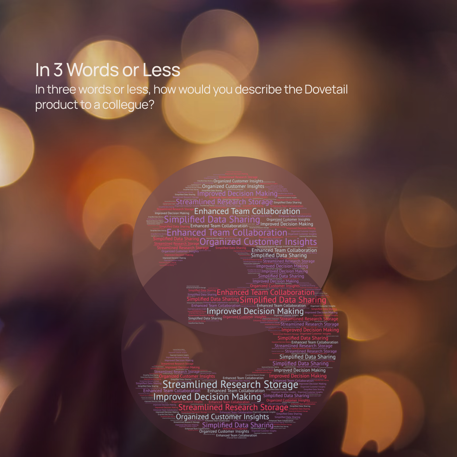
In three words or fewer, describe the Dovetail app to a colleague.
Pricing clarity:
Find the cost of the Dovetail Professional plan.
Conversion intent:
Based on what you’ve seen so far, would you consider trying Dovetail? Why or why not?
Improvement suggestions:
If you could change one thing about the site, what would it be and why?
Final thoughts:
Do you have any other feedback you haven’t shared yet?
Synthetic Patcipitants
City: Austin, TX
Job Title: Director of User Research at a SaaS Enterprise
Job To Be Done: Needs a scalable solution to turn high volumes of customer feedback from sales calls and support tickets into strategic themes his product leaders can use.
City: London, UK
Job Title: Senior UX Research Manager at a HealthTech Company
Job To Be Done: Struggles with aligning cross-functional teams on insights; wants to create visibility and shared understanding using AI-curated research summaries.
City: Toronto, Canada
Job Title: Lead UX Researcher at a Digital Agency
Job To Be Done: Seeks a flexible, intuitive research repository that supports short turnaround projects and enables quick synthesis and storytelling for client presentations.
City: New York, NY
Job Title: UX Research Manager at an eCommerce Platform
Job To Be Done: Reduce dependency on lengthy manual analysis by using AI to uncover behavioral patterns and report back to executives on a weekly cadence.
First Impressions
Before we get into deep fixes, here’s how new users feel within seconds of landing on Dovetail’s homepage:
- Usability? Promising.
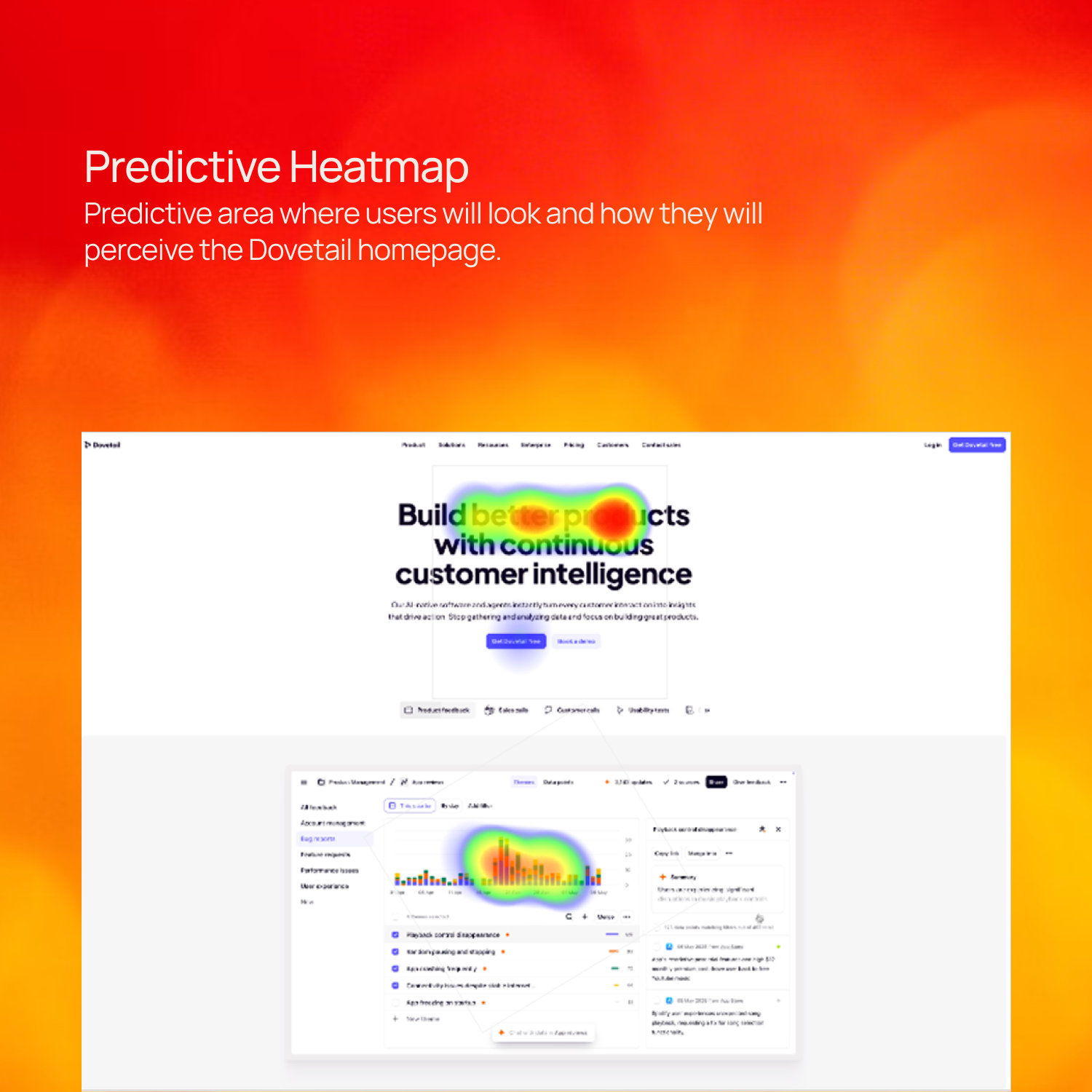
- Visual clarity? Less so.
- Messaging? Buzzword-heavy, but benefits land.
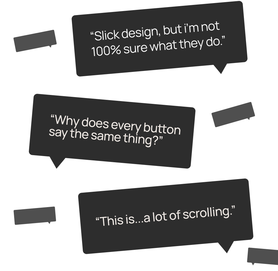
TL;DR: Dovetail makes a solid first impression, but you’ve gotta squint a little to get the full picture.
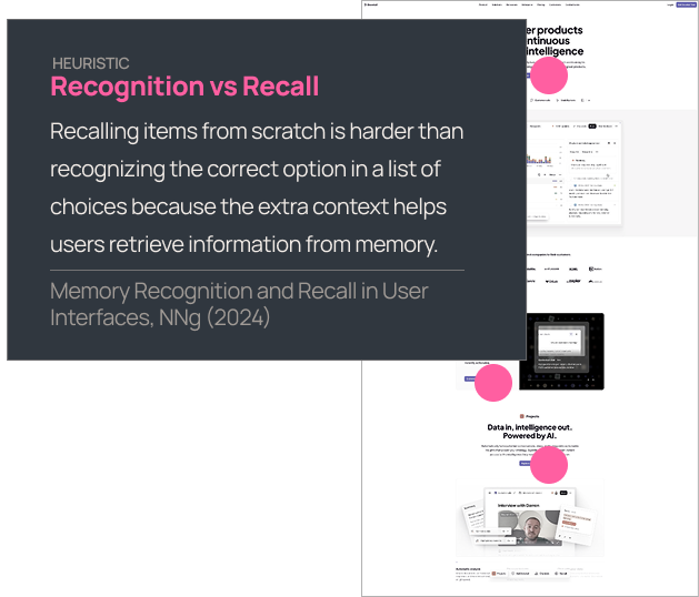
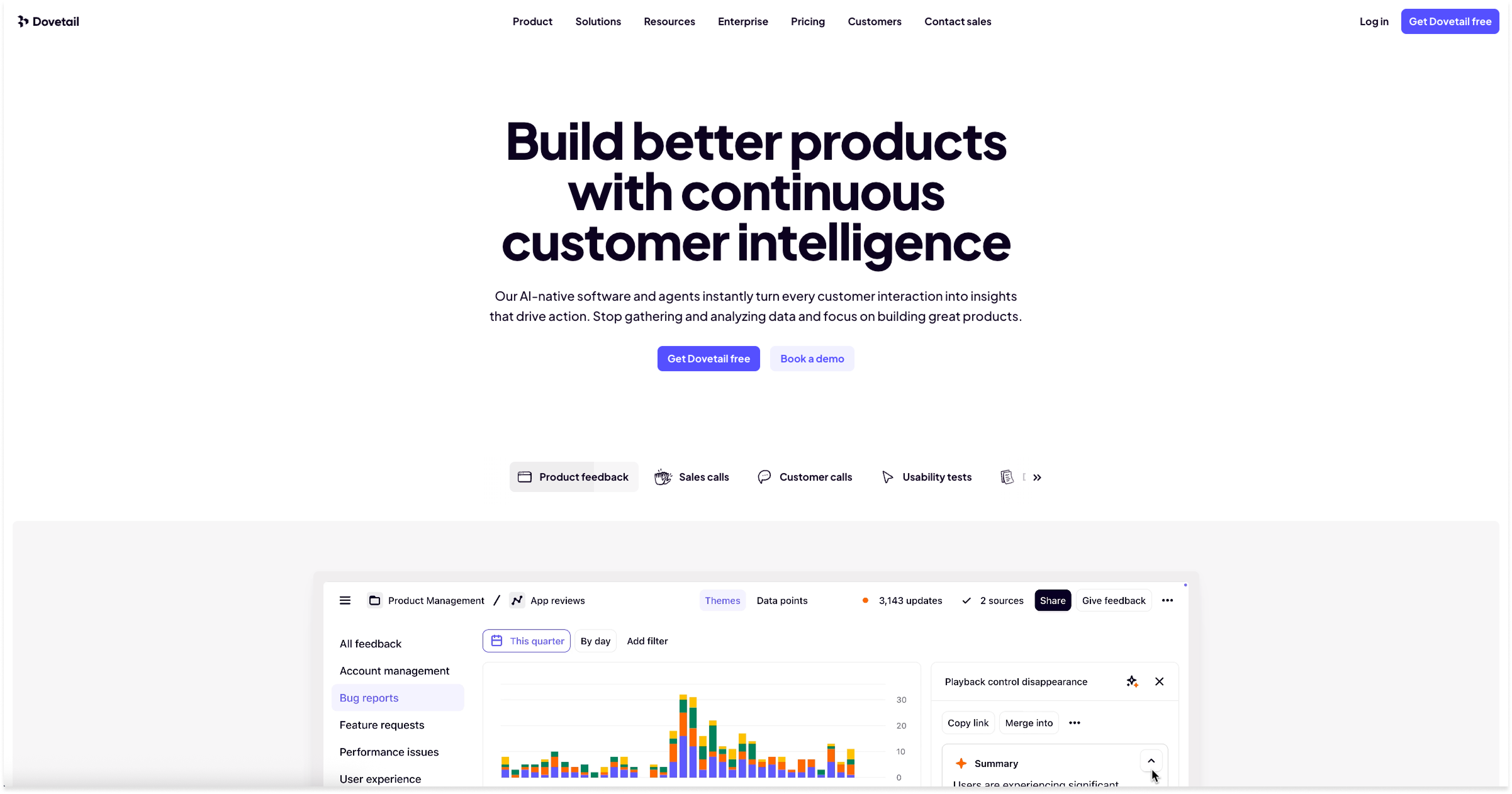
Multiple buttons on the homepage (6 at the time of this test) all say “Explore...” — but then go to different places. That’s a classic case of recognition vs. recall, and it breaks one of the oldest UX rules in the book.
Change the button labels to match their exact context (e.g., “Try for free,” “See AI in action,” “Browse integrations"Dive into projects”). Give users clear paths without asking them to guess.
The less users have to remember, the faster they act. That means more quality clicks, fewer drop-offs.
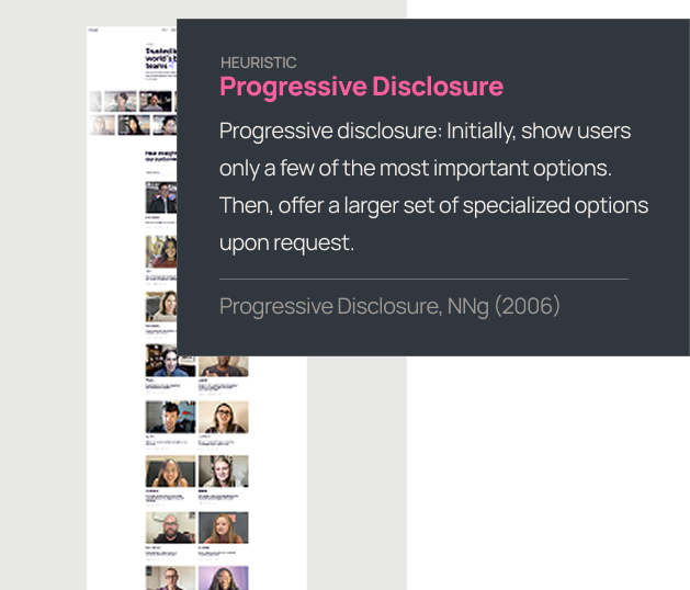
Repetitive structure = mental fatigue. Everything starts blending together, and key messages get lost in the blur.
Pull the most important content forward, and beyond that, let them explore. Break up the pattern. Vary the visuals. Leverage size and contrast (alt backgrounds, layout shifts, even micro-interactions).
The quicker they can find what they are looking for, the more engaged they will be. And engaged users stick around long enough to convert.
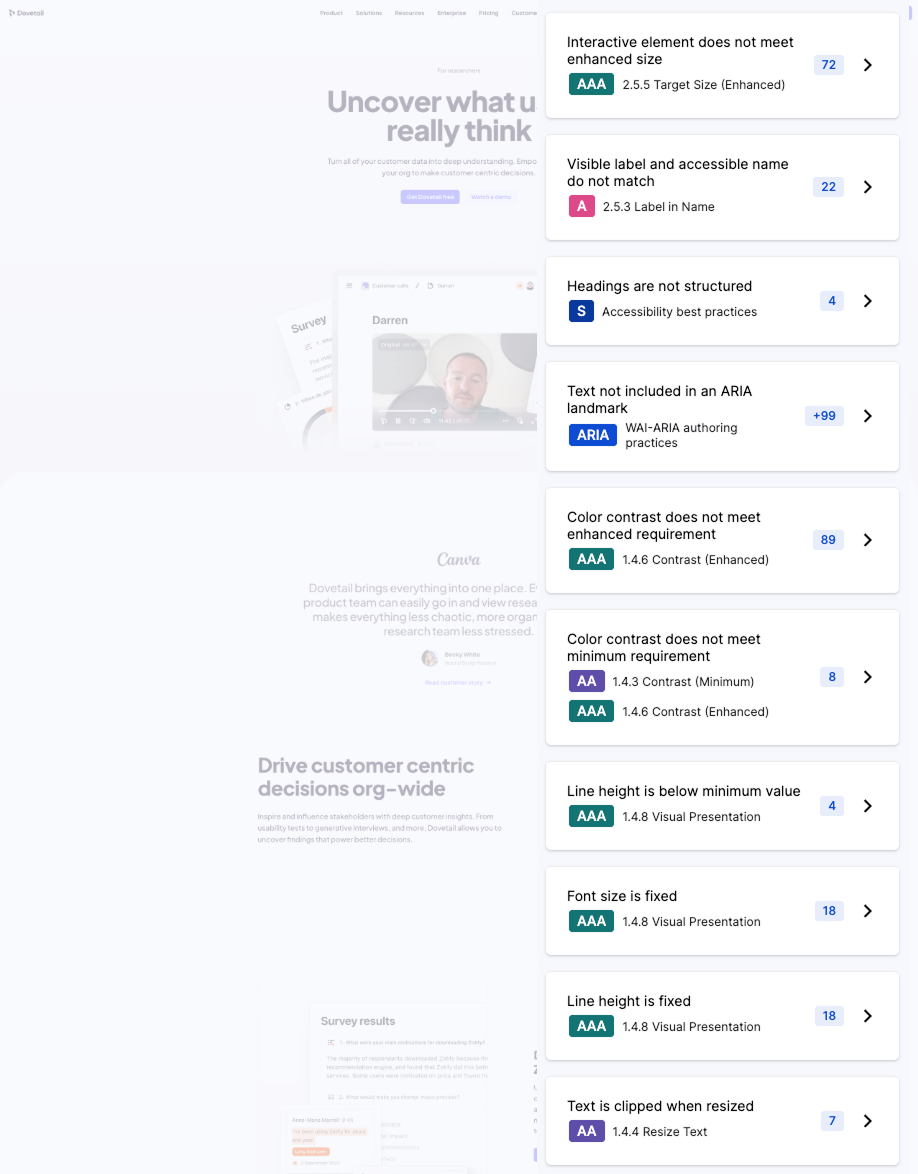
Dovetail’s homepage stumbles on several key accessibility checks:
- Low contrast text (especially on screenshots)
- Small tap targets
- Mismatched button labels
This creates friction — especially for visitors using screen readers, high zoom, or touch navigation.
How to fix it:
- Add overlays or text alternatives to screenshots
- Increase button size and spacing
- Match visible labels to code labels for AT compatibility
Accessibility is usability — for everyone. And accessibility-conscious orgs (Dovetail buyers) expect better.
Final Thoughts
Dovetail’s site is smart, modern, and built for attention — but in some key areas, it talks over its users. With a few focused tweaks, it could go from “promising” to persuasive.
What’s working:
- Strong use of visuals and motion
- Messaging that speaks to real user pain
- Trust-building stats and social proof
What's holding it back:
- CTA overload without context or clarity
- Repetitive layout that numbs engagement
- Accessibility gaps that exclude key users
With smart fixes, Dovetail can amplify what it already does well — and deliver an experience that matches the product it’s selling: intuitive, insightful, and usable by everyone.
Meet Flywheel
Your Always-On AI Research Assistant
The Flywheel Growth UX Agent doesn’t just test your product — it uses it. It builds synthetic participants, runs full-scale usability tests, and then thinks like a senior UX researcher — spotting hidden issues, prioritizing what matters most, and recommending fixes that actually drive growth.
This is The Flywheel Effect — continuous, high-quality research without the recruiting, delays, or guesswork.
- Better UX fuels more engagement.
- More engagement generates richer customer data.
- Richer data sharpens the Flywheel’s next round of insights.
It’s a loop that only gets smarter with every spin.
See what it can do for you→ Learn more at Flywheel Growth
The Upside
Sign up to receive The Upside - the Flywheel monthy newsletter highlighting growth stories and new tools and added to the platform.

Stop thinking small - let it fly
Privacy Policy
Flywhweel 2025
RESOURCES
Insights
Who We Are
Icons & Illustrations by Streamline
Animation by Weldi 33 Studio Design